AnimatedToastView enhances SwiftUI applications by automating view transitions with smooth animations. By customizing the duration and leveraging various transition effects.
Code Overview
Here’s the implementation and usage of AnimatedToastView:
struct AnimatedToastView<Content: View>: View {
    @State private var isVisible: Bool = false
    private let content: () -> Content
    private let displayDuration: CGFloat

    init(displayDuration: CGFloat, @ViewBuilder content: @escaping () -> Content) {
        self.displayDuration = displayDuration
        self.content = content
    }

    var body: some View {
        VStack {
            if isVisible {
                content()
            }
        }
        .task {
            withAnimation(.easeInOut) {
                isVisible = true
            }
            Timer.scheduledTimer(
                withTimeInterval: TimeInterval(displayDuration),
                repeats: false) { _ in
                    withAnimation(.easeInOut) {
                        isVisible = false
                    }
                }
        }
    }
}
Understanding the Structure
State Management: The
@StatepropertyisVisibledetermines when the content should be displayed, automatically triggering animations when it changes.Initializer: Accepts a
displayDurationto define how long the content should stay visible before being animated out of view, and acontentview which will be animated.Task Modifier: Used to schedule the animations:
- Initially animates
isVisibletotrue, making the content appear with a smooth animation. - A
Timeris used to handle the automatic disappearance of the view after the specified duration.
- Initially animates
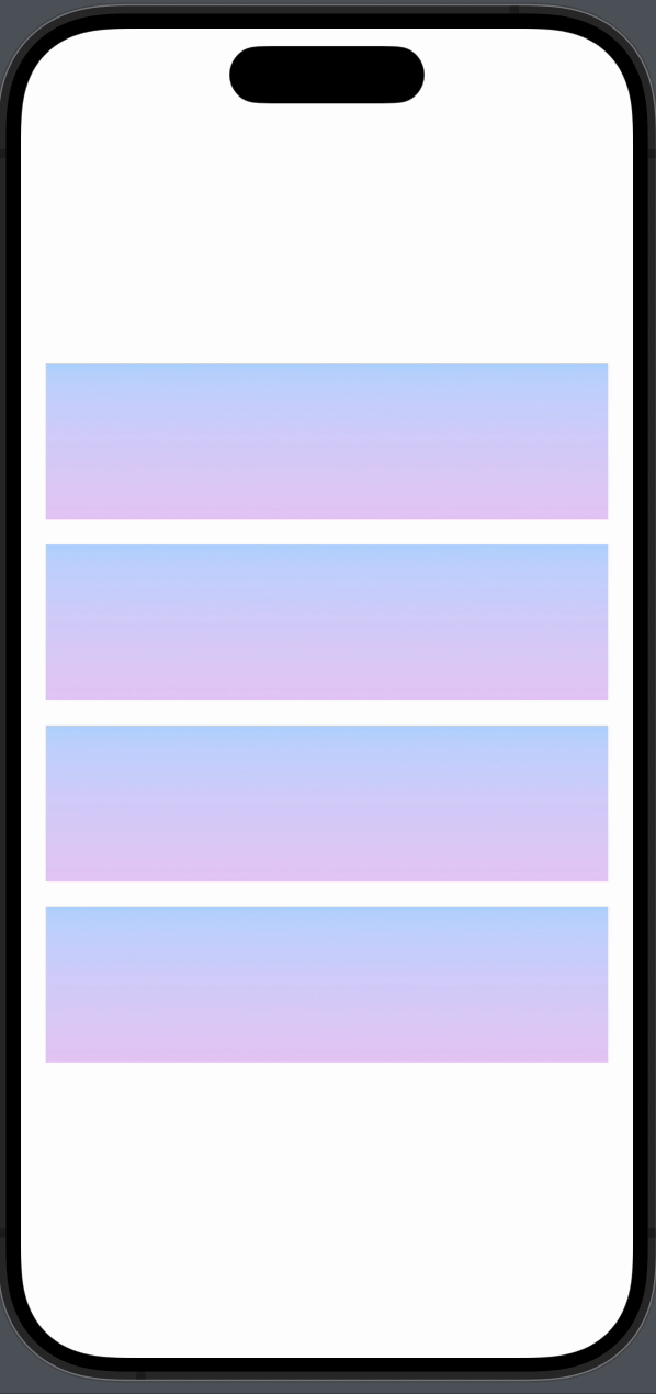
Preview
The animation for showing/hiding the content of AnimatedToastView is fully customizable.
struct ContentView: View {
    var body: some View {
        VStack(spacing: 16) {
            ZStack {
                background
                AnimatedToastView(displayDuration: 2.0) {
                    sampleText
                }
            }.frame(height: 100)

            HStack {
                background
                AnimatedToastView(displayDuration: 3.0) {
                    sampleText
                        .transition(.move(edge: .trailing))
                }
            }.frame(height: 100)

            HStack {
                AnimatedToastView(displayDuration: 3.0) {
                    sampleText
                        .transition(.move(edge: .leading))
                }
                background
            }.frame(height: 100)

            VStack() {
                background
                AnimatedToastView(displayDuration: 4.0) {
                    sampleText
                        .transition(.move(edge: .bottom))
                }
            }.frame(height: 100)
        }
        .padding()
    }

    @ViewBuilder
    private var background: some View {
        LinearGradient(
            gradient: Gradient(colors: [Color.blue.opacity(0.3), Color.purple.opacity(0.3)]),
            startPoint: .top,
            endPoint: .bottom
        )
    }

    @ViewBuilder
    private var sampleText: some View {
        Text("Welcome to SwiftUI!")
            .font(.headline)
            .padding()
            .background(Color.green)
            .cornerRadius(12)
            .shadow(radius: 5)
    }
}
You can find the source code here