Adding visual interest to your SwiftUI views is a breeze with animated dashed borders. Let me guide you through creating a custom dashed border that can bring a refreshing dynamism to your UI designs.
Implementation Details
Take a look at our refined implementation of the DashedRoundRectView. It’s designed to offer you an animated, customizable dashed border for rounded rectangles. This view is both flexible and adaptable to diverse design requirements:
import SwiftUI

struct DashedRoundRectView<DashColor: ShapeStyle>: View {
    let lineWidth: CGFloat
    let dashCount: Int
    let size: CGSize
    let cornerRadius: CGFloat
    let duration: CGFloat
    let dashColor: DashColor
    let dashPhase: CGFloat
    let dashLength: CGFloat

    @Binding var phaseAnimation: Bool

    init(
        lineWidth: CGFloat,
        dashCount: Int,
        size: CGSize,
        cornerRadius: CGFloat,
        duration: CGFloat,
        dashColor: DashColor,
        phaseAnimation: Binding<Bool>
    ) {
        self.lineWidth = lineWidth
        self.dashCount = dashCount
        self.size = size
        self.cornerRadius = cornerRadius
        self.duration = duration
        self.dashColor = dashColor
        self._phaseAnimation = phaseAnimation

        // Calculation for the perimeter
        let perimeter = 2 * (size.width + size.height)
            - (lineWidth * 4) // subtracted to remove the overlaps at the corners.
            - (8 * cornerRadius) // subtracted to remove the length of the rounded corner part
            + (2 * .pi * cornerRadius) // added 4 rounded corners which is a whole circle

        self.dashLength = perimeter / CGFloat(dashCount * 2)
        self.dashPhase = dashLength * 2.0
    }

    var body: some View {
        RoundedRectangle(cornerRadius: cornerRadius)
            .strokeBorder(dashColor,
                          style: StrokeStyle(
                            lineWidth: lineWidth,
                            lineCap: .round,
                            lineJoin: .round,
                            dash: [dashLength],
                            dashPhase: phaseAnimation ? dashPhase : 0))
            .frame(width: size.width, height: size.height)
            .animation(phaseAnimation
                       ? Animation.linear(duration: duration).repeatForever(autoreverses: false)
                       : Animation.default, value: phaseAnimation)
    }
}
Key Parameters Explained
Our DashedRoundRectView empowers you with extensive customization options. Here’s how each parameter plays a role:
lineWidth: Sets how bold or subtle your border line appears.dashCount: Determines how many dashes make their way around your view’s perimeter.size: Controls the overall dimensions of your rectangle.cornerRadius: Ensures each corner has that stylish, smooth curve.duration: Dictates the pacing of your border animation.dashColor: Lets you play with different hues or gradients to match your design aesthetics.
Diving Deeper: Perimeter, Dash Length, and Dash Phase
Let’s take a closer look at what goes into making those dashes tick:
Perimeter Calculation: First, we get the total perimeter by considering both the straight edges and those smoothly rounded corners:
$$ \text{perimeter} = 2 \times (\text{width} + \text{height}) - (\text{lineWidth} \times 4) - (8 \times \text{cornerRadius}) + (2 \times \pi \times \text{cornerRadius}) $$
dashLength: With the perimeter in hand,dashLengthdetermines how long each dash and its accompanying gap are, making sure they’re evenly spaced:$$ \text{dashLength} = \frac{\text{perimeter}}{(dashCount \times 2)} $$
dashPhase: This controls the offset of the dashes along the stroke path, creating that seamless flow in your animations:$$ \text{dashPhase} = \text{dashLength} \times 2 $$
These give your view a smooth, flowing animation, breathing life and character into your designs.
Customization and Preview
Wondering how this looks in action? Check out the following preview to see an example implementation in SwiftUI with a vibrant gradient and shadow:
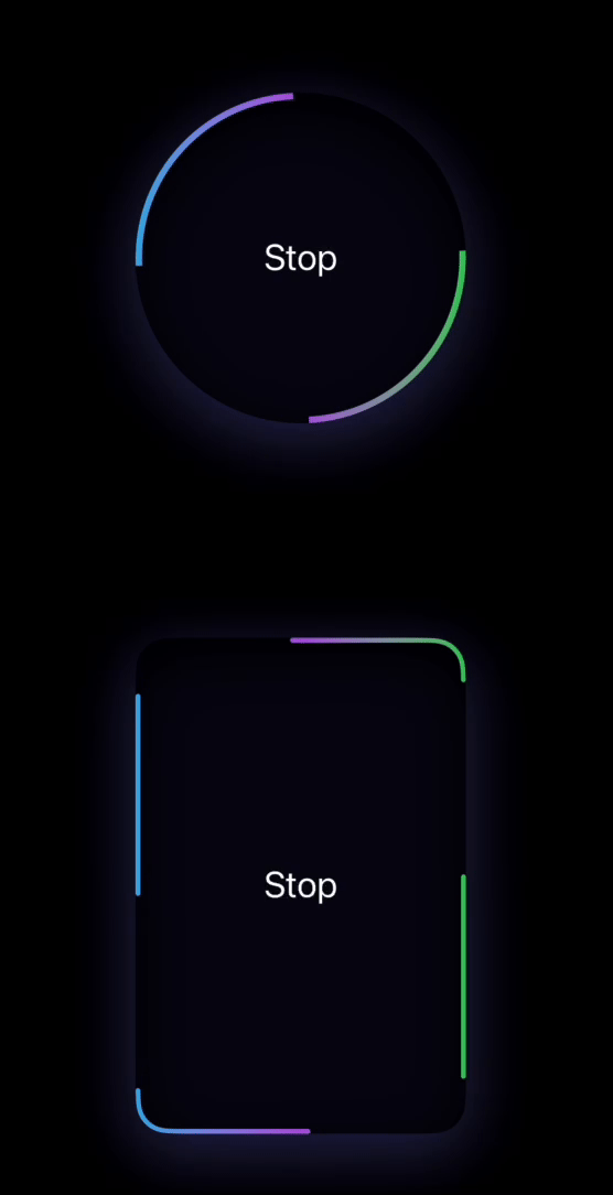
With these steps, you’re well on your way to crafting a unique and dynamic UI experience. Feel free to tweak each parameter to suit your style or purpose—explore, experiment, and enjoy the process of creation with SwiftUI!
You can find the source code here